
Delusions of Dashboards
Declare your independence from ineffective dashboards and redefine metrics that spark clarity not clutter!

One signal 🔭
One prompt 🧠
One subtraction opportunity ➖
Created by Sam Rogers · Published by Snap Synapse for people who prefer clarity over clutter
🔭 Signal: Declare Independence from Vanity Metrics
In the spirit of Independence Day in the US, here’s a firework worth lighting:
Dashboards.
Maybe this week is the week to set one free! 🎆
Alignment is awesome. But the illusion of alignment is dangerous. A common problem with dashboards is that different teams stare at the same data and reach opposite conclusions. How? Each group silently drags in its own definitions, incentives, and “obvious truths” that are so obvious to them that they go unstated.
Not all dashboards are bad. So don’t light any up that help a team decide something. We’re talking about giving an incendiary goodbye to the ones that look good in meetings but never change anything.
Why now? Because AI. When we leverage AI to auto-generate prettier charts and dashboards (as is happening more and more!), the illusion only gets shinier and more convincing…instead of more useful.
What I’m seeing
Product wants feature adoption
Ops wants efficiency
Execs want quarterly growth
Everyone clicks the same graph and thinks, “Yep, that’s exactly what I needed”
Then decisions diverge. Reading dashboards becomes less like checking the weather and more like reading horoscopes. It’s just vague enough for everyone to see what they want. Or what they don’t want depending on how they feel that day, also entirely preventable.
Why it matters
Data without shared context isn’t insight, it’s narrative fuel.
And AI just pours gasoline on that fire by cranking out visualizations faster than anyone can reconcile meaning.
🧠 Strategic Prompt
Try one of these as a conversation starter today :
Which KPI is interpreted differently by at least two departments, and what deadline is forcing them to decide anyway?
or
What’s the last “obvious” metric that sparked an eye-roll, Slack rant, or meeting meltdown?
➖ Suggested Subtraction
Archive one auto-generated report no one acts on.
Every org has at least one. Find it 📊 then free it! 🎇
Ask three questions:
Who actually changed course because of this report in the last 90 days?
If it disappeared tomorrow, who would notice?
Can we merge its only useful slice into another view (and kill the rest)?
Independence begins with subtracting what is no longer needed.
🃟 Analogy of the Week: Tarot Dashboards
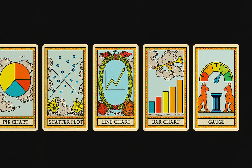
A data dashboard can be a lot like a tarot deck: same cards, endless interpretations.
One viewer sees growth. Another sees risk. A third sees “my budget’s safe.”
The cards didn’t change. Only the stories we project onto them did.
If you don’t align on meaning before the reading, the cards can’t align you afterward.
That’s why you don’t just need better dashboards. You need shared meaning.
🎶 Closing Notes
Metrics should inform, not enthrall.
→ A Signals Briefing can help map decorative dashboards and surface the few metrics worth defending—so your org celebrates strategic independence instead of spinning fireworks.
→ Prefer interactive guidance? Meet the CAIO Copilot, built from the same Signals DNA (and freshly updated!).
→ Quick Question: Do you subscribe to any paid AI tools (ChatGPT, Claude, etc)? Hit reply and let me know. It’ll help tailor next week’s issue.
Until next time,
Sam Rogers
Organizational Independence Facilitator
Snap Synapse